First of all i looked at a site called 'KULER' which is a color theme generator that allows you to experiment with colors to see what works well together. I thought this would be a good site to start with to decided upon the color theme before i designed my website.

This is the most popular color theme on 'Kuler' and it is one of my favorite, i think there are many types of websites that this color theme would work well with such as a music website or a shop.
However i don't think it is a good choice for a Photography website as the colors would distract from the main focus and function of the website the Photographs themselves.
So i decided to experiment with some more neutral colors.

I thought the above worked really well and that is the basic theme used for my first website that got up to the stage of the lightbox and then started to have problems. It was at this point where i restarted my website with a completely new design and using a simple black and white color theme as shown below.

The following are the Screen shots of the websites i visited for inspiration these are the sites i researched.
http://www.bottlebellphotography.com/
http://rankin.co.uk/
http://www.danielkennedy.com/
I found these website through a website called Smashing Magazine

All these websites are photography websites.
This is the Homepage of Ashley Lebedov's website Bottle Bell photography .com. What really draws me into this website at first glance is the gallery linked images that appear in the middle of the page.
These images link respectively to 'Faerieland' project, 'Moodscapes', Portraiture and the 'Forgotten' galleries. I think this is a really good feature for a photography website to have, however i find the opening sequence to this website to be quite pointless and seen as every time you click the home page or refresh the home page this sequence starts up, i find this feature very annoying.

Once i got onto the proper home page I thought the page looked nice and was easy to navigate, i thought the links location worked well even though its low on the homepage instead of at the top which is normally where it appears. What i think works the most on this site is the split images which appear on the centre of the site, i think this looks creative and the images link to different project galleries by the photographer which is a nice touch.

I really liked the about me page on this website the images looping on the left and writing to the right seemed to really hold the viewers attention with minimum effort.

I thought the below gallery was a bit boring and the images where too small.


I liked the above gallery it was easy to use and looked neat and tidy but the navigation was quite difficult due to very small page titles and links.

The about / contact was awful the writing was too small and the color really didn't allow the viewer to read the text easily.
The bellow gallery is quite good simplistic but easy to use. I like the idea of using a slide show on my website.

This website just looked too cluttered and the links where too small and to the left which made navigation very difficult.

For my website i wanted to use a nice purple/blue color and a white font, the font was a quite interesting but not too distracting which is why i choose it.

I split all these up into there own specific parts using slicing in photo shop i did this because it makes linking a lot easier when everything is in its own separate area.

These individual images appear in the 'images' folder for easy access.

Once the initial index page is open i had to save the it 4 times and name them, 'index' for the homepage, 'About' for the about page and so on for the other two. After doing this it meant i had 4 pages to start working with. As shown below.

I then needed to start linking the pages to each other eg, index to portfolio and vice versa, so that each page linked back to every other page.

After linking i had to remove the middle layer of the site so i could place an image in the space, i did this by removing the tag <img> shown below.

I then needed to create a image container for the image i wanted to place in the space id just removed the tag <img>.

I needed to get the dimensions perfect for the size i had removed and for the image size i wanted to place there.

Once the image was imported into the space i needed to decided which image i was going to choose for the homepage.

Homepage Done

Simple About me page.

For the portfolio page i wanted to use the light box technology some websites use which make thumb nails enlarge to full size in the middle of the screen, below was an example that i found and decided to edit in order to use for my own website.

This is an example of what light box does.

I changed the script in dream weaver so i could import my own images .

Below shows an example of one of my images in my gallery using light box.

At this point things where too cluttered, and things started to fail because of it.

Because the files where unorganized i had a huge problem with linking and parts of the website stopped working bellow are all examples of this.


This problem was caused because the files where in to many different places so below i showed how to resolve his issue by properly categorizing each each element into its relevant folders except the web pages themselves.

However by this point i was rethinking the whole website, as it was causing too many errors in different parts of the site its self. That is the reason i started again from scratch.
For this website i wanted to use a simple black and white color scheme because as a visual aid photographs look better against either a black or white background.
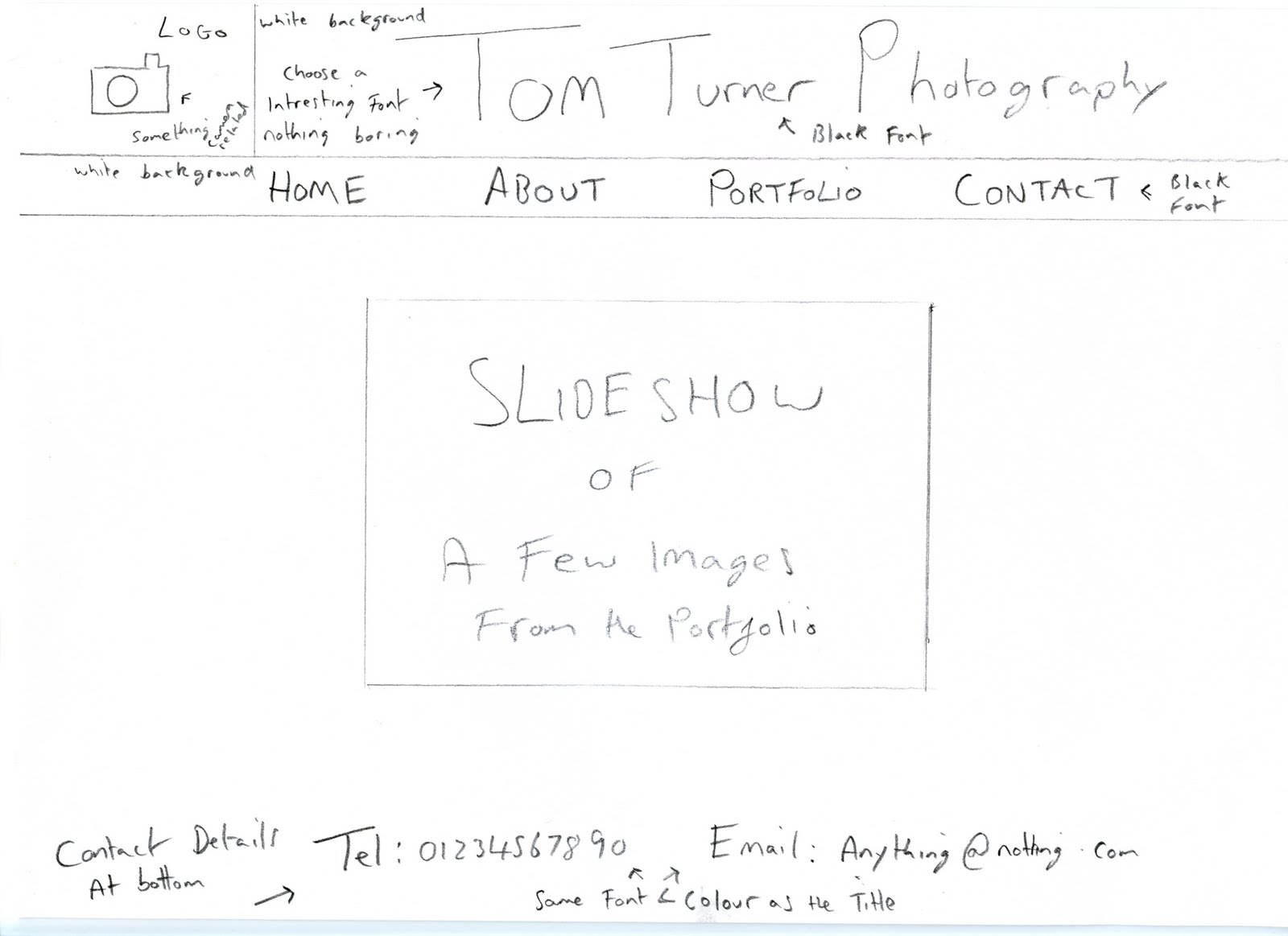
So i started to design the new website, bellow i have shown 4 pages of designs for the website i create showing what goes where, what color, what font etc.
Home/Index Page
About Page

Portfolio Page

Contact Page

From these sketches i produced the site bellow , i followed the same steps as i had previously however this time i created an organized set of folders and Web files from the start so i didn't have to move anything and then mess about inside dream weaver re linking everything.

Above is the icon i created for the logo on my website, created in photo shop, i used a normal clip art camera and edited it to make it unique for me.

I choose to use 'Bleeding Cowboys' which is a font from Dafonts.com i chose it because its a non standard font which is interesting and draws the viewer in.
The Links to each page are also in the bleeding cowboys font for consistency reasons.

This is how the new website Homepage looks like , i wanted there to be an easy seen slide show on the main homepage for a pleasant viewing experience and to show what the website was about as soon as the viewer comes onto the site.

Above is the script i have used to create the slide show shown below

This is one of the images on the slide show this is the 2nd in the sequence of 4 which loop, i only wanted 4 as a taster so the viewer would go to the portfolio page to see more work.

This is my about me page showing a little information about me as a photographer and below is where i will be inserting my video once it is made and edited.

Above is the Portfolio page all thumbs once clicked project a much larger full image in the middle of the screen as shown on the image below.

This is an example of the light box technology i have used for presenting my portfolio
I also changed the script a little bit so that i could put a small amount of info at the bottom of my images.


This is the lightbox script i used in my website.

On my contact page i have created an extra blog to this one with all of this 'Web Design Log' on it so i had a public version which is shown on the link below and one for my uni work and myself on this site, blogger.


The thing i found most difficult about this website was the initial designing stage of the website and deciding upon a design i was happy with, the end design i am pretty happy with in the end.
The part that took the longest in this whole process was the tedious process of resizing images for website and resizing and cropping for the thumb nails. My main problem was as explained earlier was the problem i had with linking because of the files all being in different places and not being organized, i resolved this by re organizing everything into named folders in the same place for easy access and even tho i had resolved this issue on the original website i decided to restart with another design anyway and am happy i did so.
Overall i am very happy with my Simplistic portfolio website, i started with the intention of having a basic website that did the job of hosting my portfolio and giving the viewer a pleasurable experience and i believe i have done this with my website.